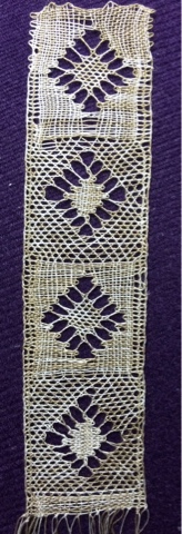
Finished exercise #3 and, sure enough, the first section looks pretty bad but once you get past that, it's not so bad. The edges are pretty good and the centers are good.
I think if I was using this as an insert in a garment (as opposed to something that was going to be framed), I think I would do something like this with close colors to make it seem less flat.
It's been fun playing with the colors.
No comments:
Post a Comment